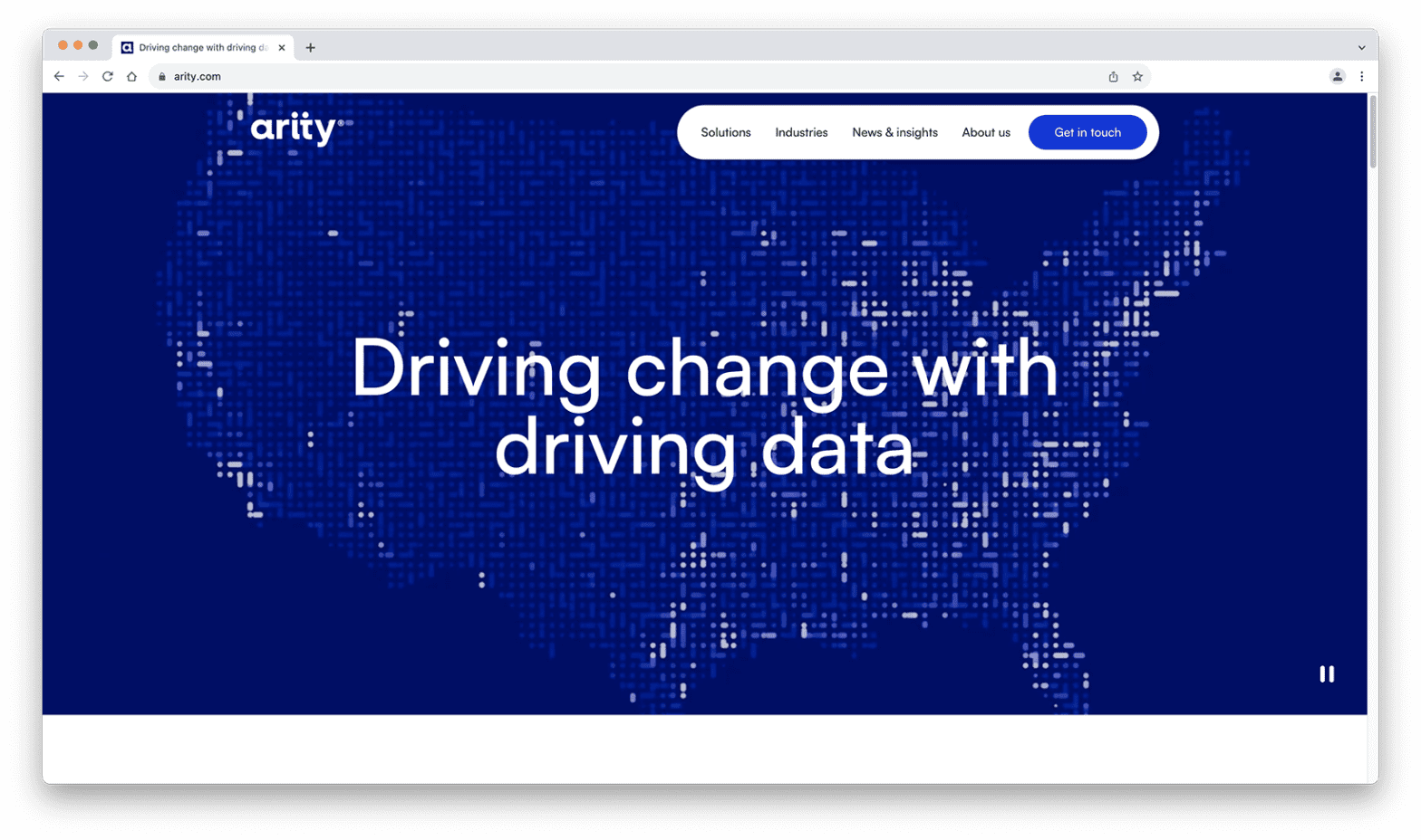
I have exciting news to share with you all. The Arity brand has gone through a refresh, and now arity.com has a new look.
Our business has shifted over the past five years, and it’s important how we share our story externally is in line with how we have evolved. Our website is the biggest expression of our team, and we want it to reflect who we are and what we do.
Here are a few key design elements and what they represent:
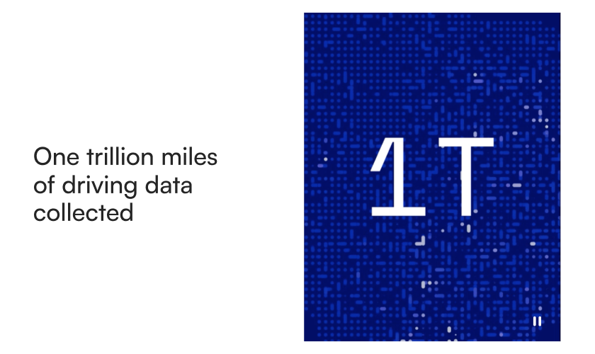
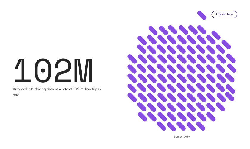
- Data – Arity is proud to offer solutions that are powered by the world’s largest driving database tied to insurance claims, and our new website reflects that by bringing visualization of that data to the forefront.
- Motion – We’ve previously used dots and dashes to help convey the power of Arity’s data insights, but we wanted to evolve how we express this. So, we brought it to life on our new website through motion. The “dot-dash” now varies in shape and movement, portraying the different stages of processing, collecting, and analyzing data.

- Bold color palette – The Arity mission is to make transportation smarter, safer, and more useful for everyone. It’s a big and bold undertaking, and our new palette conveys this goal using brighter, bolder, and more accessible high contrast colors.

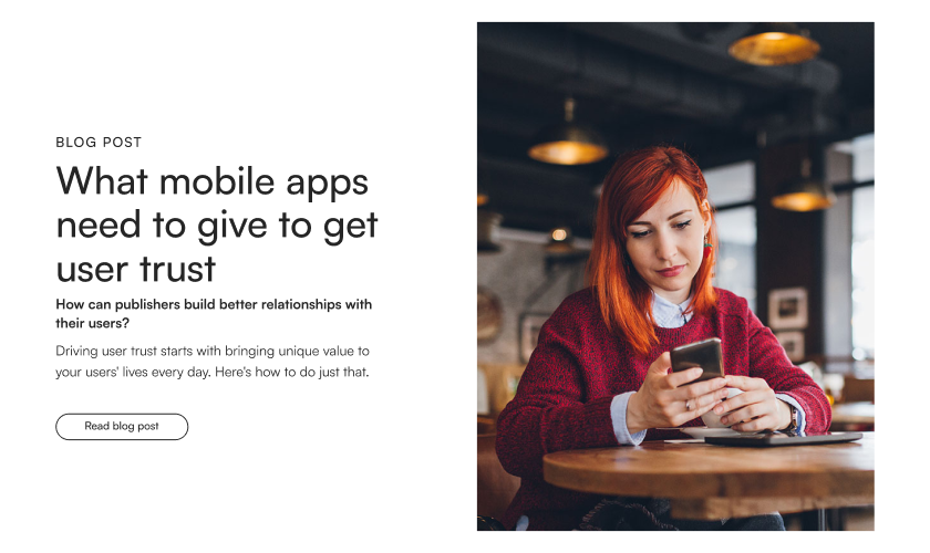
- Human-centric design – We help businesses, cities, and communities – but ultimately, we help people. Our mission is human-centric, and we wanted our website to be as well. Not only did we incorporate more real, authentic photography as a part of our refresh, but we also optimized our typography and text sizes for accessibility and readability to improve every visitor’s experience.

See our brand guidelines to find out more.


