Brand guidelines
Each day at Arity, we make sense of how people move by collecting and analyzing trillions of miles of driving data. With the world’s largest driving dataset tied to insurance claims, Arity derives unique insights that help understand and predict driving behavior at scale. We believe everyone who generates mobility data should benefit from it. We find the meaning in mobile and vehicle telematics data to create insight-driven solutions to real, every-day challenges. With our extensive driver behavior dataset, insurers, developers, marketers, and communities can create less uncertainty for everyone on the road.
Brand overview
Our brand idea:
Our mission:
Our voice attributes:
Logo
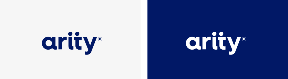
Primary logo
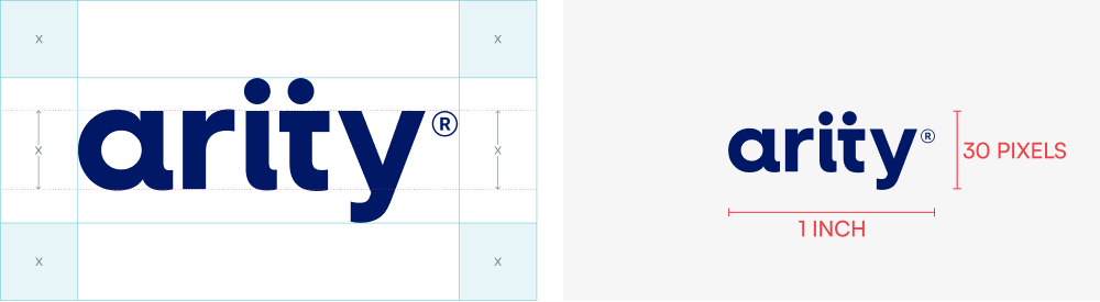
Clear space & minimum size
Clear space
Minimum size
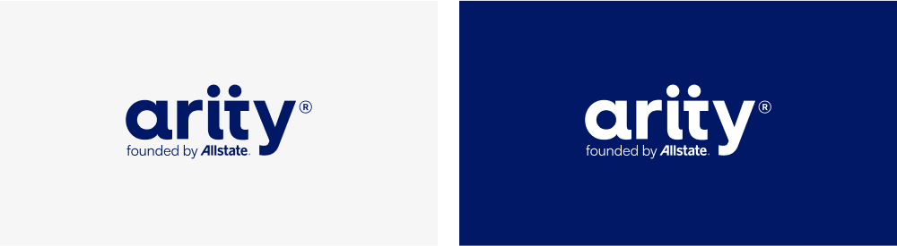
Special use logo with Allstate endorsement
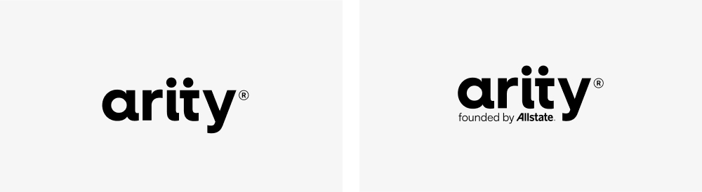
Grayscale logos (print only)
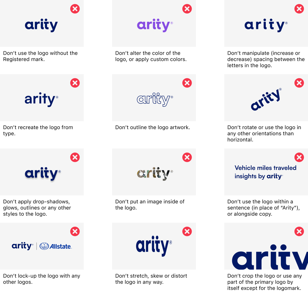
Logo don’ts
- Don’t use the logo without the Registered mark.
- Don’t alter the color of the logo, or apply custom colors.
- Don’t manipulate (increase or decrease) spacing between the letters in the logo.
- Don’t recreate the logo from type.
- Don’t outline the logo artwork.
- Don’t rotate or use the logo in any other orientations than horizontal.
- Don’t apply drop-shadows, glows, outlines or any other styles to the logo.
- Don’t put an image inside of the logo.
- Don’t use the logo within a sentence (in place of “Arity”), or alongside copy.
- Don’t lock-up the logo with any other logos.
- Don’t stretch, skew or distort the logo in any way.
- Don’t crop the logo or use any part of the primary logo by itself except for the logomark.
Logomark
Color
Sizing
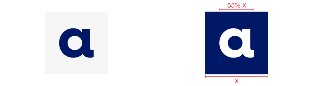
The size of the ‘a’ will vary and be determined by the specific application. As general best practice, for square formats such as a social media profile image, the width of the ‘a’ should be 55% of the total width of the format. The logomark should be centered with even clear space surrounding it.
Typography
Satoshi is a geometric sans serif typeface with a modernist look and feel. It uses circular shapes to form the counters (the area of the letter that is entirely or partially enclosed) which creates a subtle reference to our logo and dot dash pattern. The curves and rounded shapes of the typeface give it a warmth and approachability, while angular details give it a touch of sophistication and modernity. Its balanced letterforms and well-thought-out spacing contribute to an overall harmonious and pleasing typographic experience. Beyond its visual attributes, the Satoshi font supports multiple languages and character sets, promoting inclusivity and accessibility in global communication.
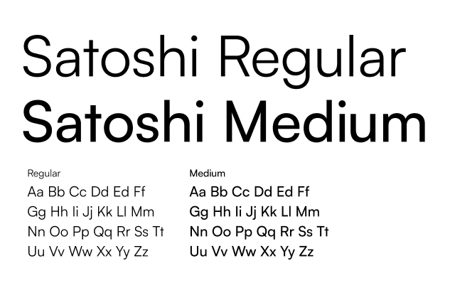
Please note the full font family includes additional weights.
Where applicable, Arial can be used as an alternate.
Color
The Arity color palette supports a diverse range of content. Base brand colors are complemented with a considered system of expressive colors that add variety and character. Together with the dotdash, these colors are key to the Arity identity.
For text, black and white are our default – here the bright expressive colors should be only used to add emphasis.
While our palette is colorful and vibrant, the way we use it is bold and deliberate.
Brand colors
Used in our logo, primary brand elements, and key communications to maintain a cohesive and recognizable look. The Arity logo is always Indigo or White.
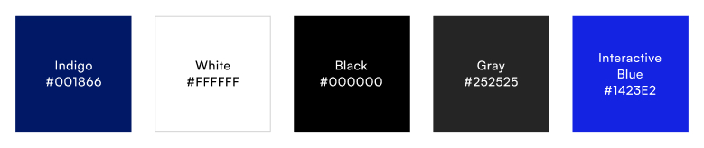
Indigo HEX #001866
White HEX #FFFFFF
Black HEX #000000
Gray HEX #252525
Interactive blue HEX #1423E2
Expressive colors
For styling the dotdash, backgrounds, and data, expressive colors provide additional depth and adaptability to the brand identity. Indigo and Periwinkle are the default, while Moss and Green, Grape and Violet, Forest and Teal, and Brick and Red are used for extra character, to evoke desired emotions and perceptions, and to highlight key texts, KPIs, or data points.

Indigo HEX #001866 | R0 G24 B102 | C100 M91 Y34 K26 | PMS 280C
Periwinkle HEX #6C6CF4
| R108 G108 B224
| C72 M63 Y0 K0
| PMS: 2718 C
(pair: Indigo/Periwinkle)
Moss HEX #0A4C1A
| R10 G76 B26
| C91 M42 Y100 K47
| PMS: 2411 C
Green HEX #16AC35
| R22 G172 B53
| C78 M0 Y99 K0
| PMS 354 C
(pair: Moss/Green)
Grape HEX #260F60
| R38 G15 B96
| C100 M100 Y31 K23
| PMS: 273 C
Violet
HEX #874DE2 | R135 G77 B226
| C72 M75 Y0 K0
| PMS: 265 C
(pair: Grape/Violet)
Forest HEX #003F3C
| R0 G63 B60
| C92 M46 Y61 K58
| PMS: 309 C
Teal HEX #009F9F
| R0 G159 B159
| C78 M13 Y41 K1
| PMS: 320 C
(pair: Forest/Teal)
Brick HEX #7C0F26
| R124 G15 B38
| C31 M100 Y71 K42
| PMS: 188 C
Red HEX #F5364B
| R245 G54 B75
| C0 M88 Y60 K0
| PMS: Red 032 C
(pair: Brick/Red)
Color do’s and don’ts
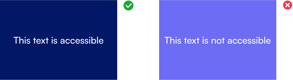
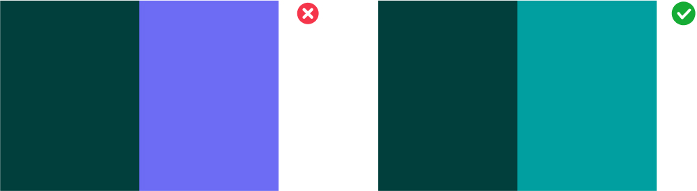
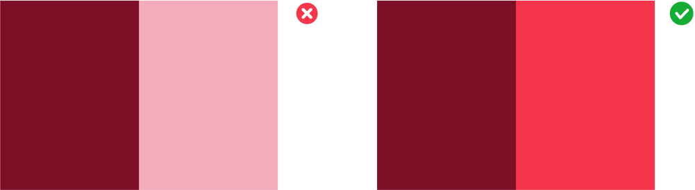
Do use our color palette in accordance with accessibility standards:
- Make sure there is sufficient contrast between text and background colors.

- Don’t pair colors that individuals with color vision deficiencies might have a difficult time distinguishing, such as some red/green combinations.
- Consider using tools like Viz Palette and Chroma.js in data visualization work to check contrast and simulate color vision deficiencies.

Do use recommended color pairings
- Don’t mix and match outside color pairing guidelines.
- Don’t make up your own tints and shades.
- Don’t create gradients from our brand colors.
- Don’t use too many colors. Stick with one color scheme/color pair in presentations, and use a combination of color and neutrals in data visualizations.

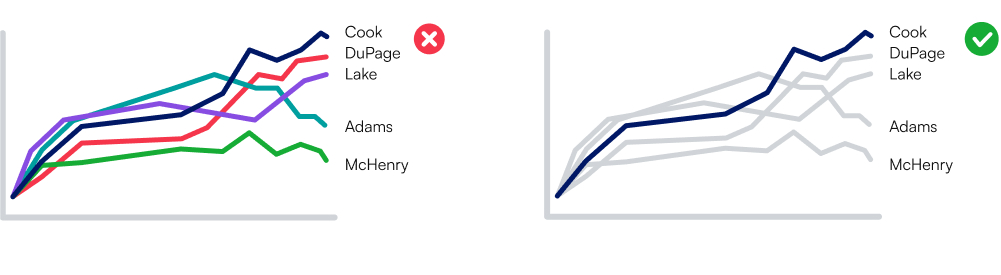
Categorical colors and extended palette
Categorical colors and an extended palette are necessary for data visualization. Check with the brand design team for the more information.
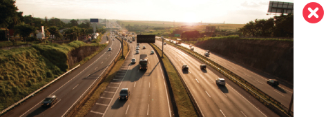
Photography
By keeping our photography style consistent, we ensure that our brand feels genuine and coherent. The foundational style for all our images should embrace a sense of focus, clarity, technology, and authenticity, and should reflect the diversity of our customers and employees, keeping our images relatable and realistic.
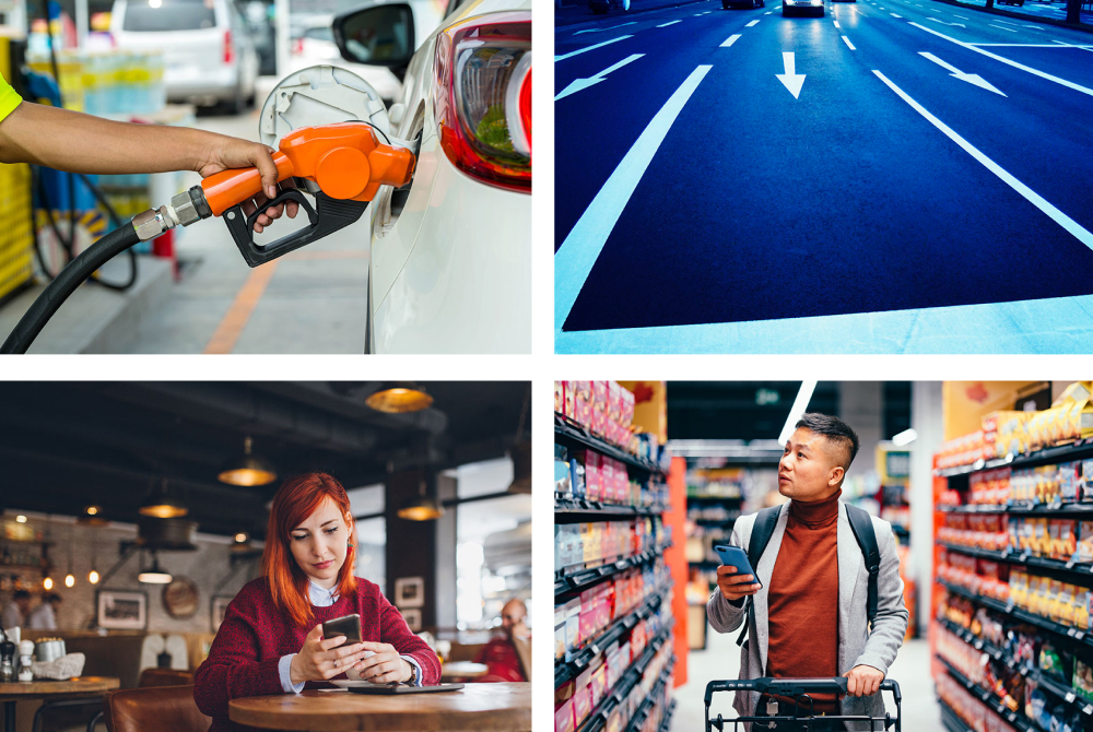
When choosing imagery, use candid imagery that clearly demonstrate the accompanying headline or key messaging, and consider cultural context to avoid generalizations or stereotypes.
Avoid the following:
- Cliche imagery or posed portraits

- Illustration/icon overlays
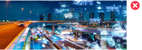
- Applied filters or noise (dust, aperture glare, etc)
- Unlicensed photography – contact the Arity Brand Marketing team for help in selecting images from our licensed photo bank